Batch22
2026
Batch22 specializes in connection. They are the intermediaries between small batch green coffee producers in Guatemala and specialty coffee roasters from around the world. Although they had already had an idea for their branding they were lost. In this rebranding we deep dived into the specialty coffee world, where we analyzed what they value, how they communicate and what they expect from their partners.
Defining who B22 was before adding a logo to it.
Before any sketches or ideas were drawn, we had to set the stage for the company. After a strategic questionnaire, (a lot) of research, and conversations with the founders, the strategy was set. We analyzed competitors from different industries, created user personas and extracted the following insights:
1
Transparency as a part of the experience.
The coffee must be communicated with information of its origin, process and quality control. Demonstrating its a credible and quality product.
2
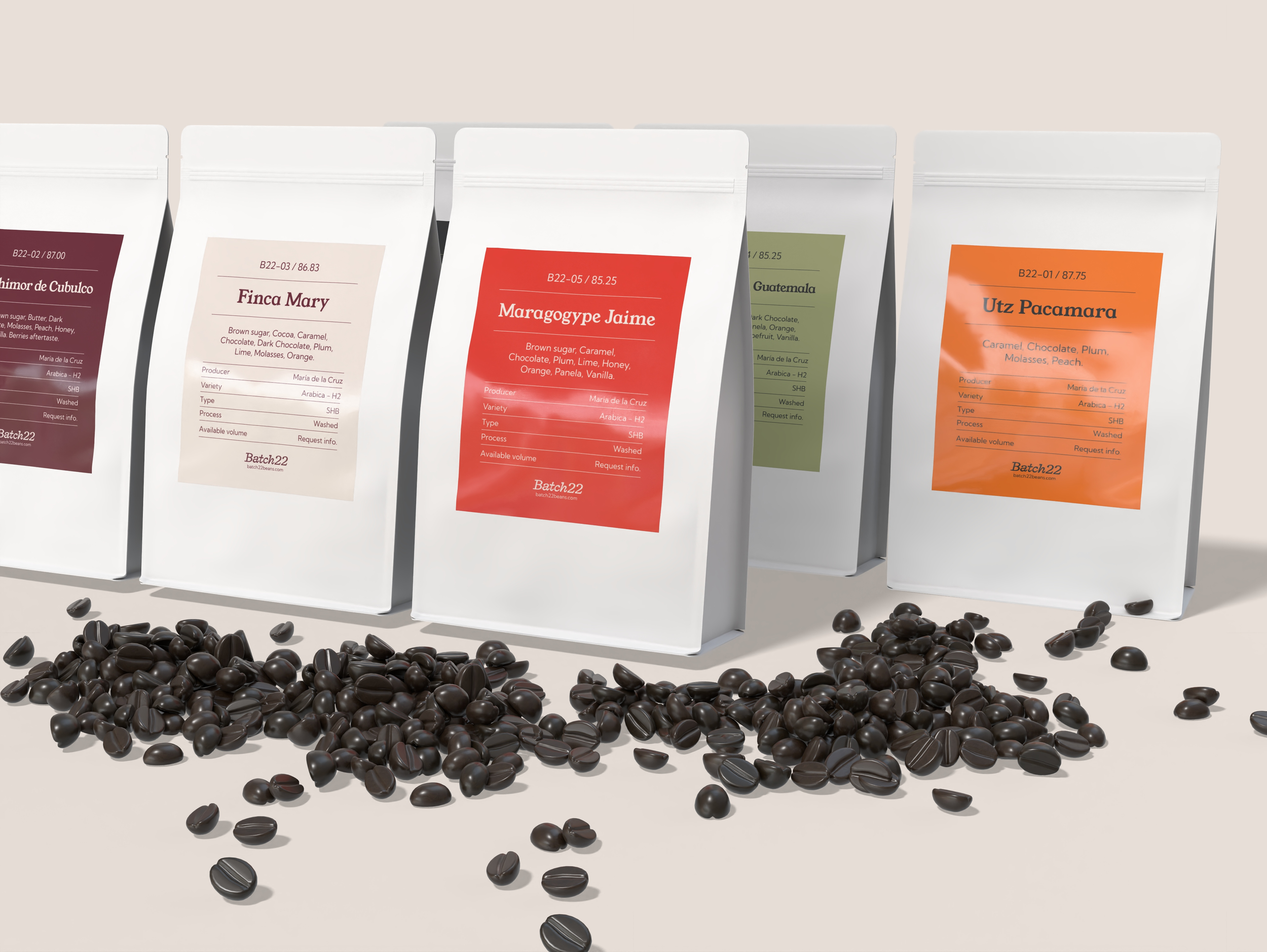
Differentiate each coffee with its strengths.
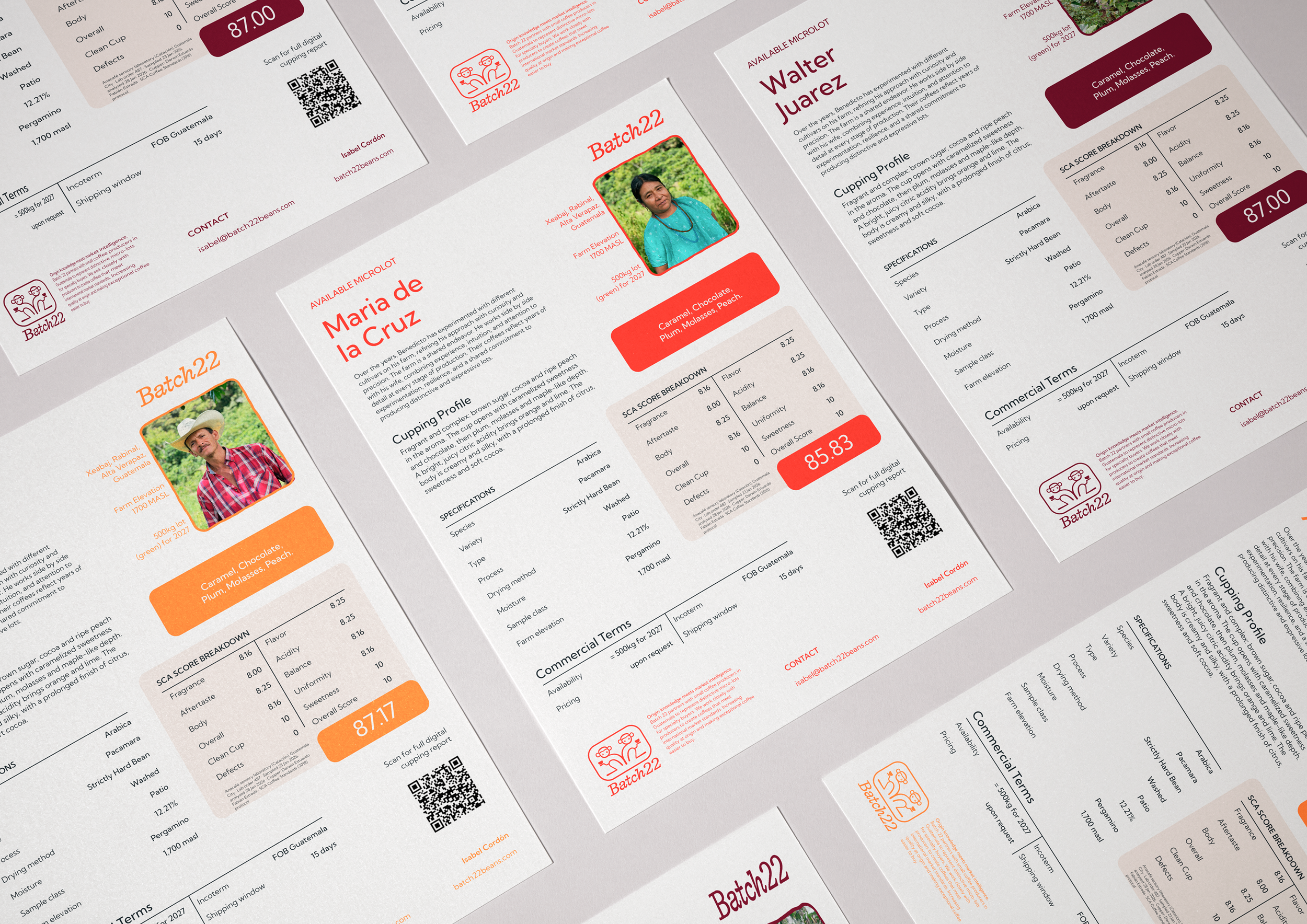
Show quickly and confidently what makes each coffee different, without overwhelming the buyer with information.
3
Create credibility through simplicity in processes.
Removing uncertainty by having clear information on availability, volumes timelines and expectations can be a great way to show credibility without having a long track record.
4
Show your knowledge and use it to your favor.
The closeness to origin provides specific information that can be useful for the buyer. Use it to sell the next batch.
An identity that feels familiar yet credible.
After reviewing the strategy and different creative directions, we decided to stick with our roots. B22’s team had already started working on a logo, which we then deconstructed, redesigned and built to match the goals, tone of voice and personality of the brand.
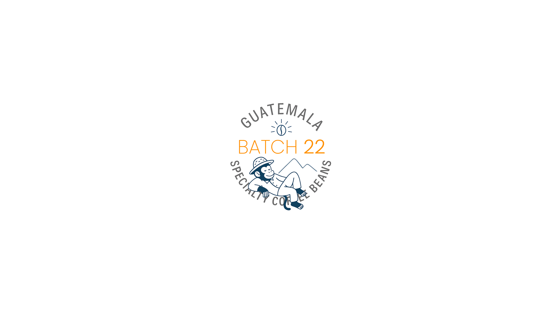
Before
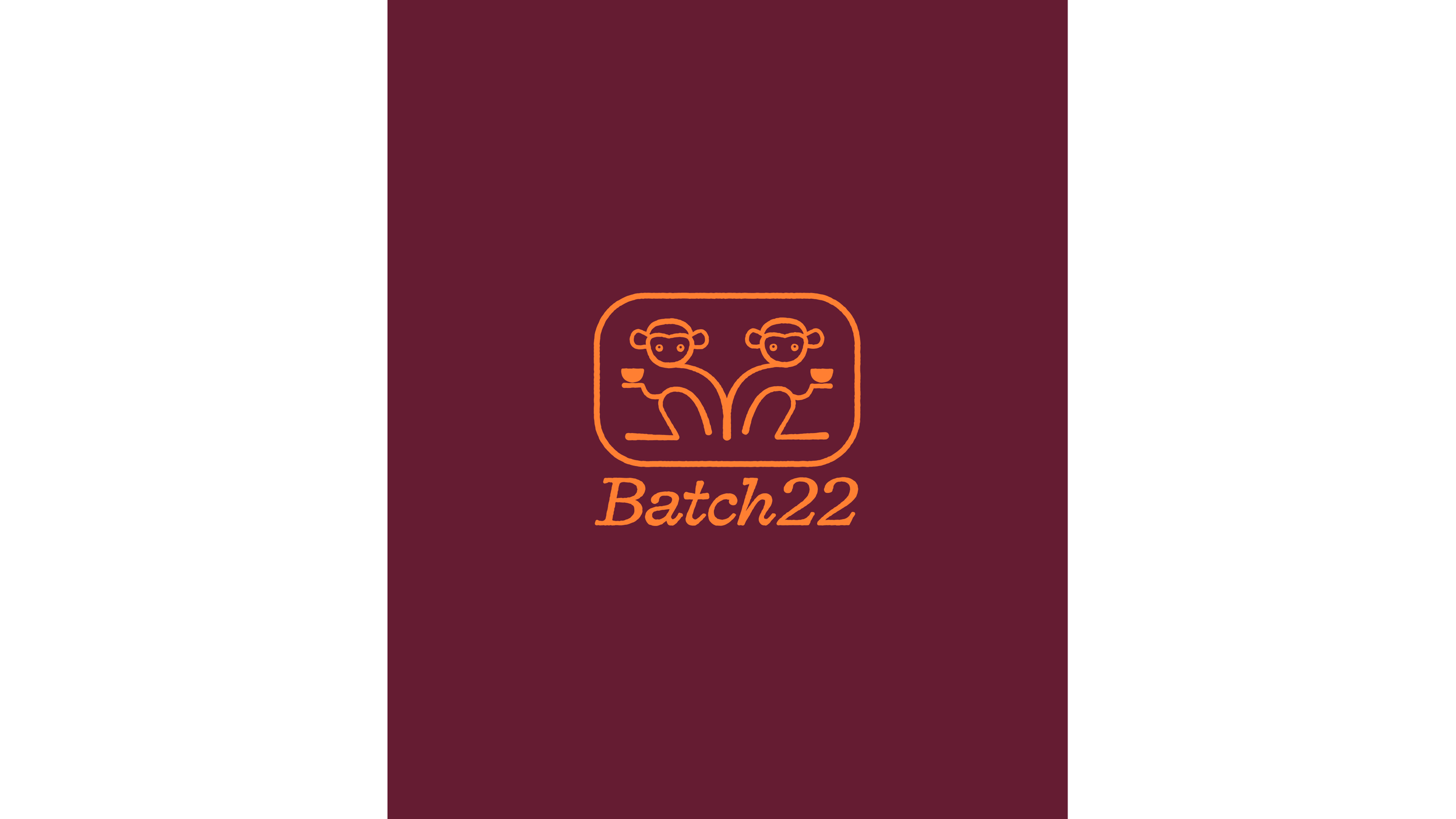
After
Logo system that adapts.


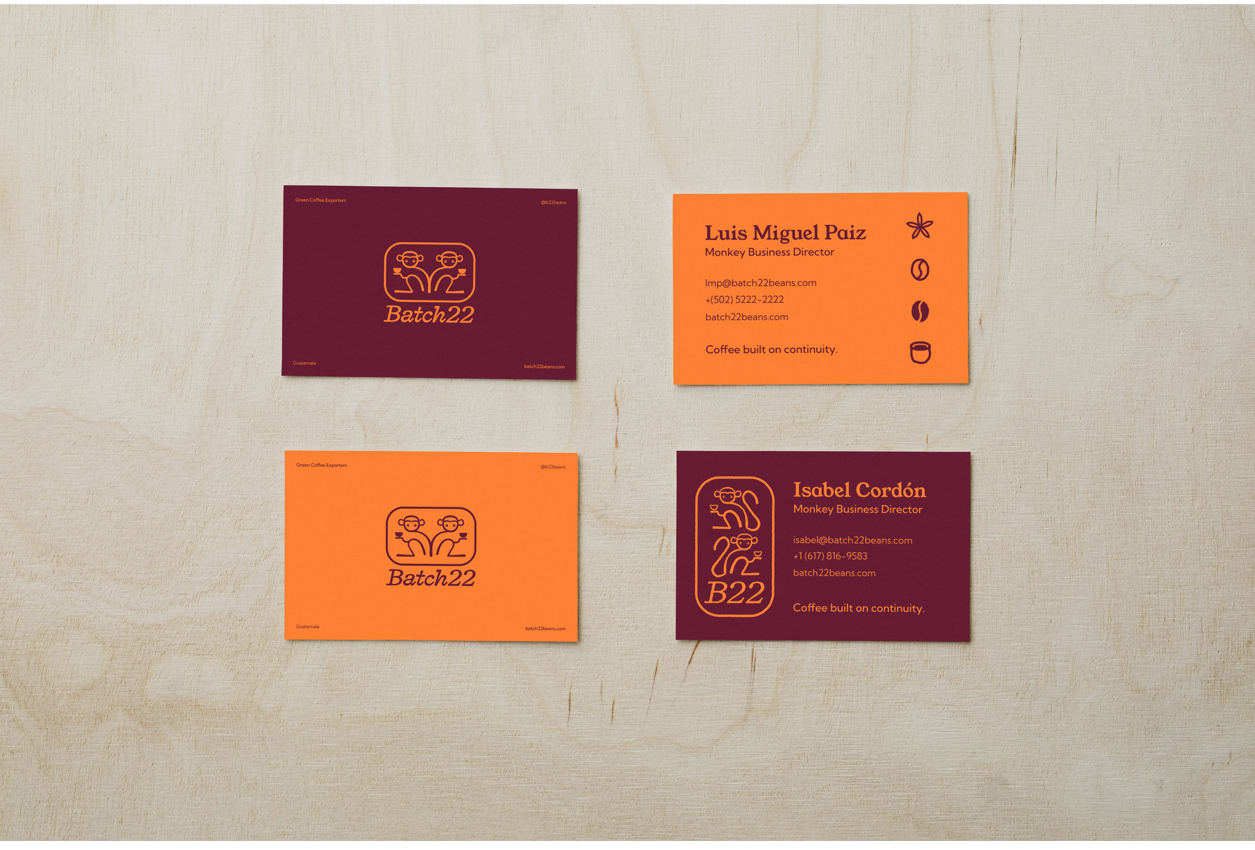
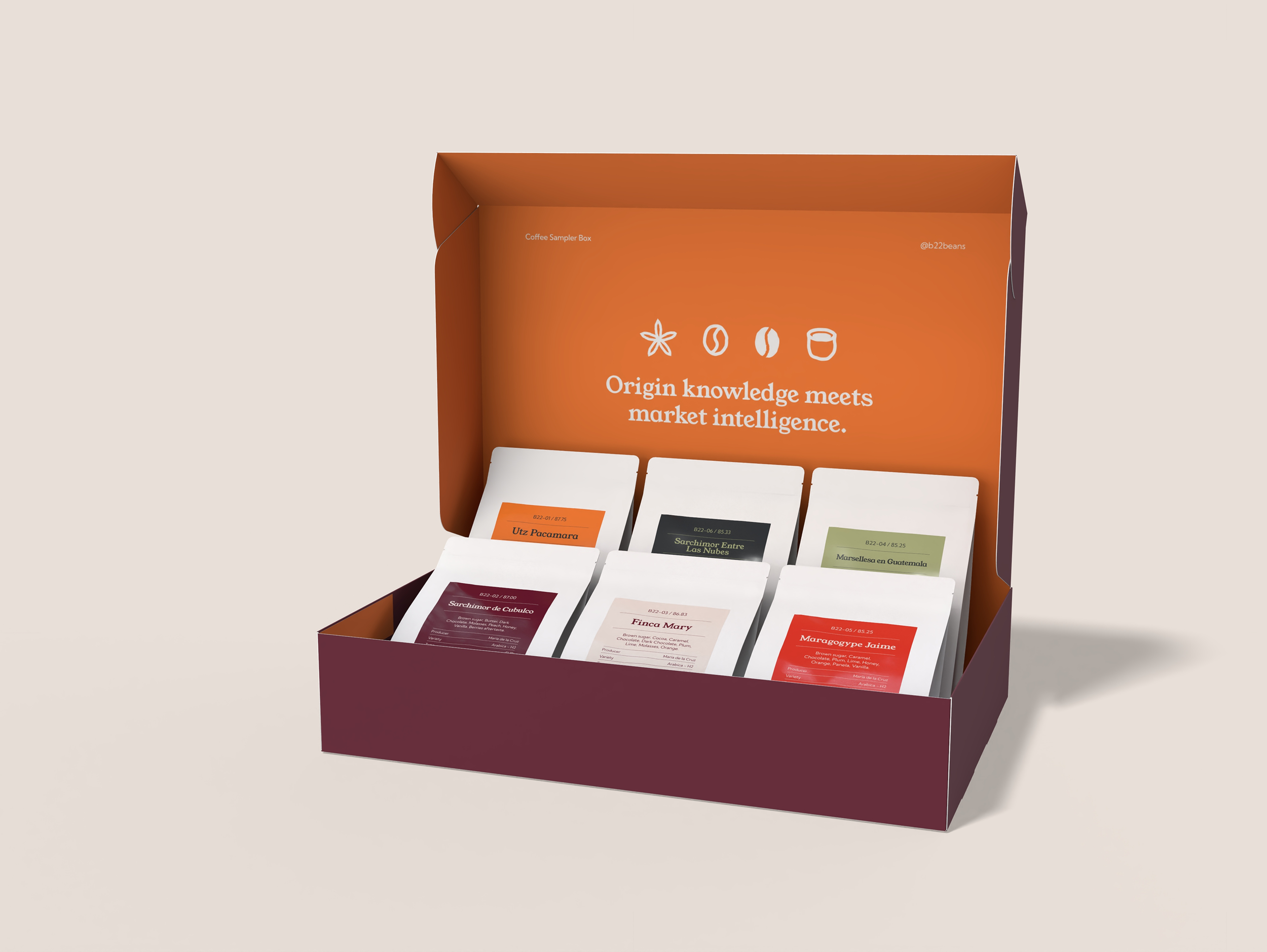
The color palette was carefully chosen so that most combinations gave legible and distinct results. The deep burgundy and vivid orange create an impactful combination, while the off black, cream white, bright red and light green colors complement them, without competing.

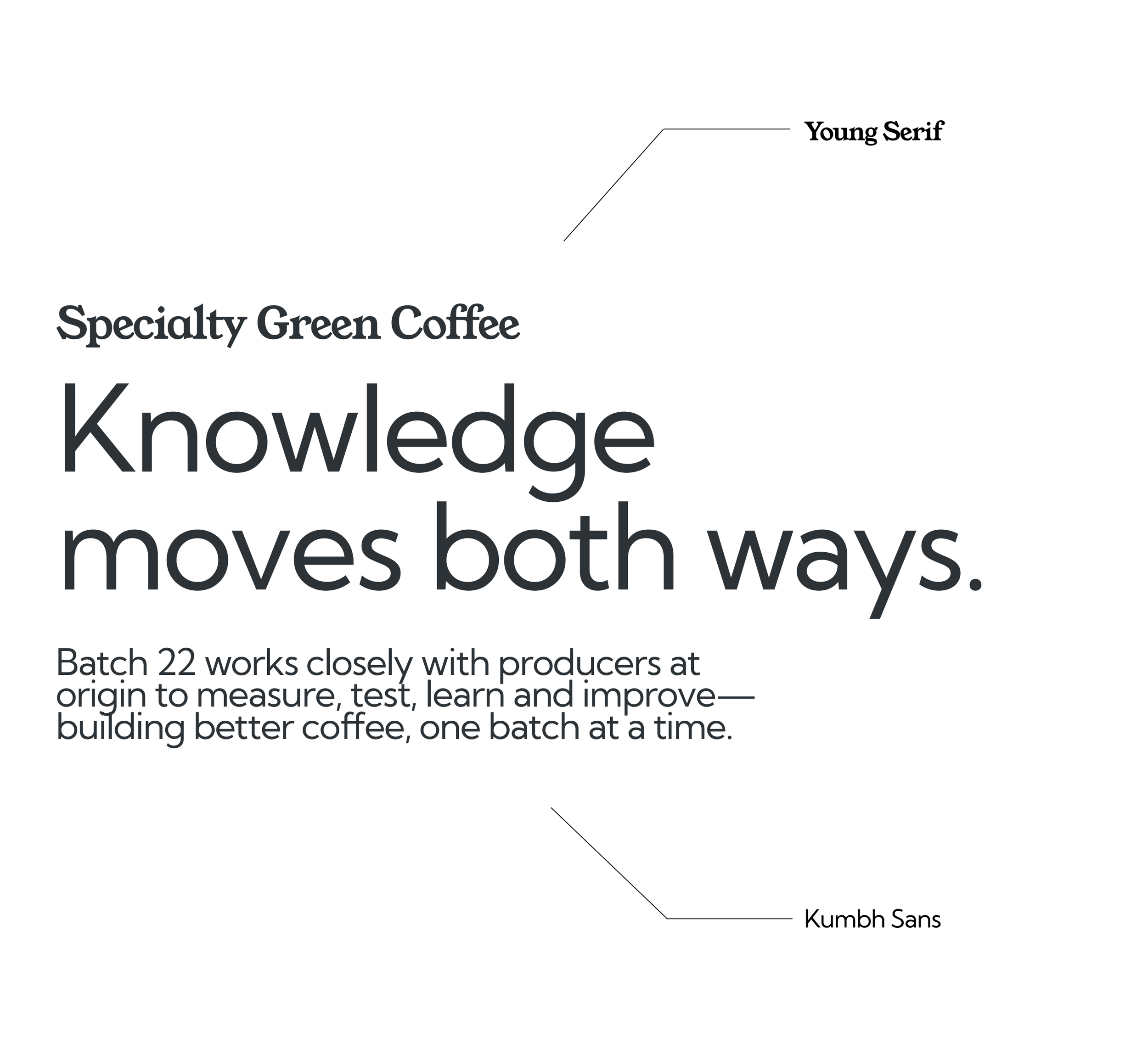
Kumbh Sans makes the brand feel modern and knowledgable. Its clean, contemporary forms provide clarity and structure while maintaining an approachable character across both digital and print applications. Young Serif, the secondary font, adds warmth and contrast to the primary typography, making it ideal for selected headlines, statements, and storytelling moments.
A custom set of 6 icons was illustrated, made to represent the journey that Batch22 makes possible. From bloom, to flower, to green bean, to roasted bean, to tasting cup and finally to a coffee lover’s cup.






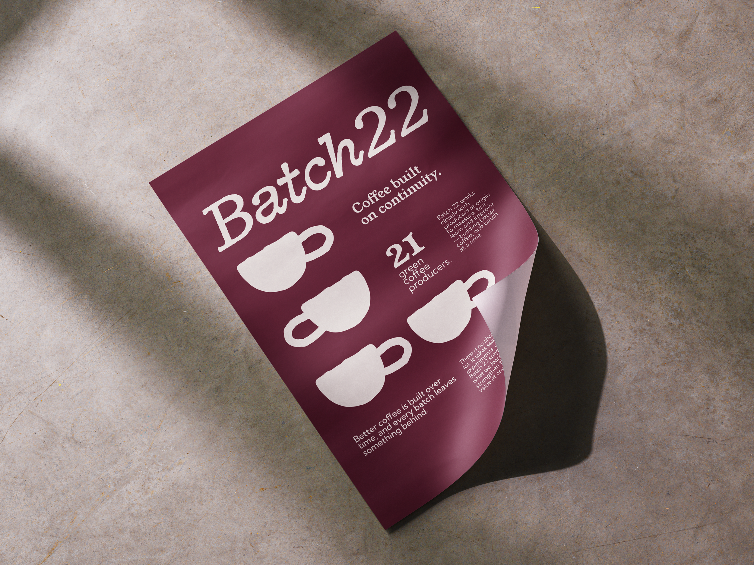
Coffee built on continuity.