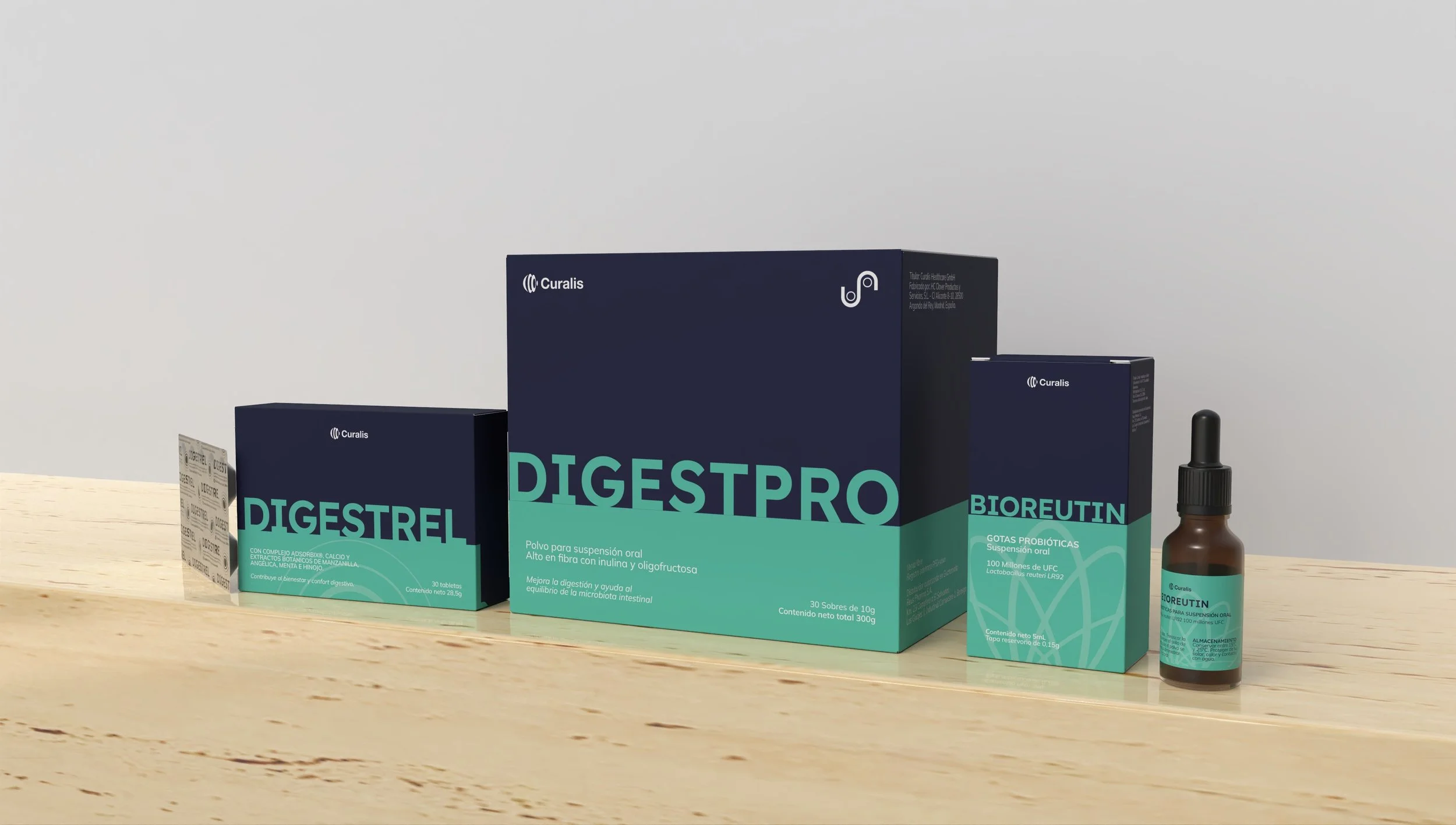
Curalis Healthcare
2025
Curalis is a German healthcare brand focused on developing high-quality supplements and pharmaceutical products for markets around the world.
With a growing portfolio and plans to expand into different product categories, the brand needed a visual system that could communicate quality and trust while remaining flexible enough to grow with it.
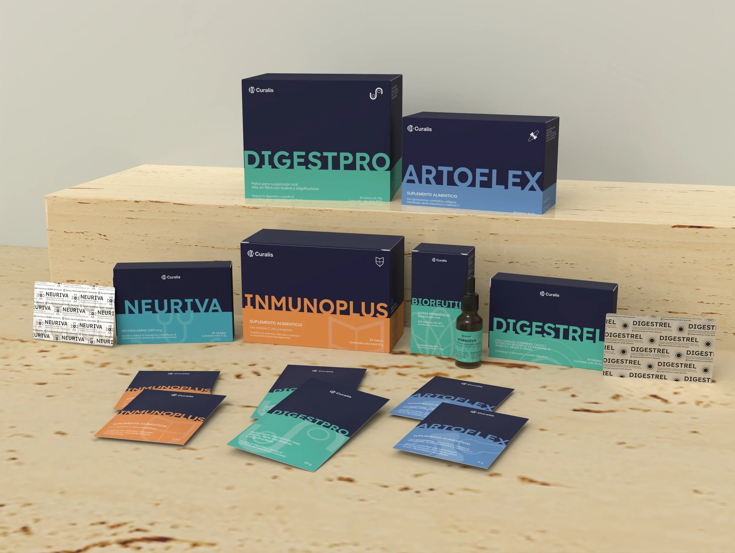
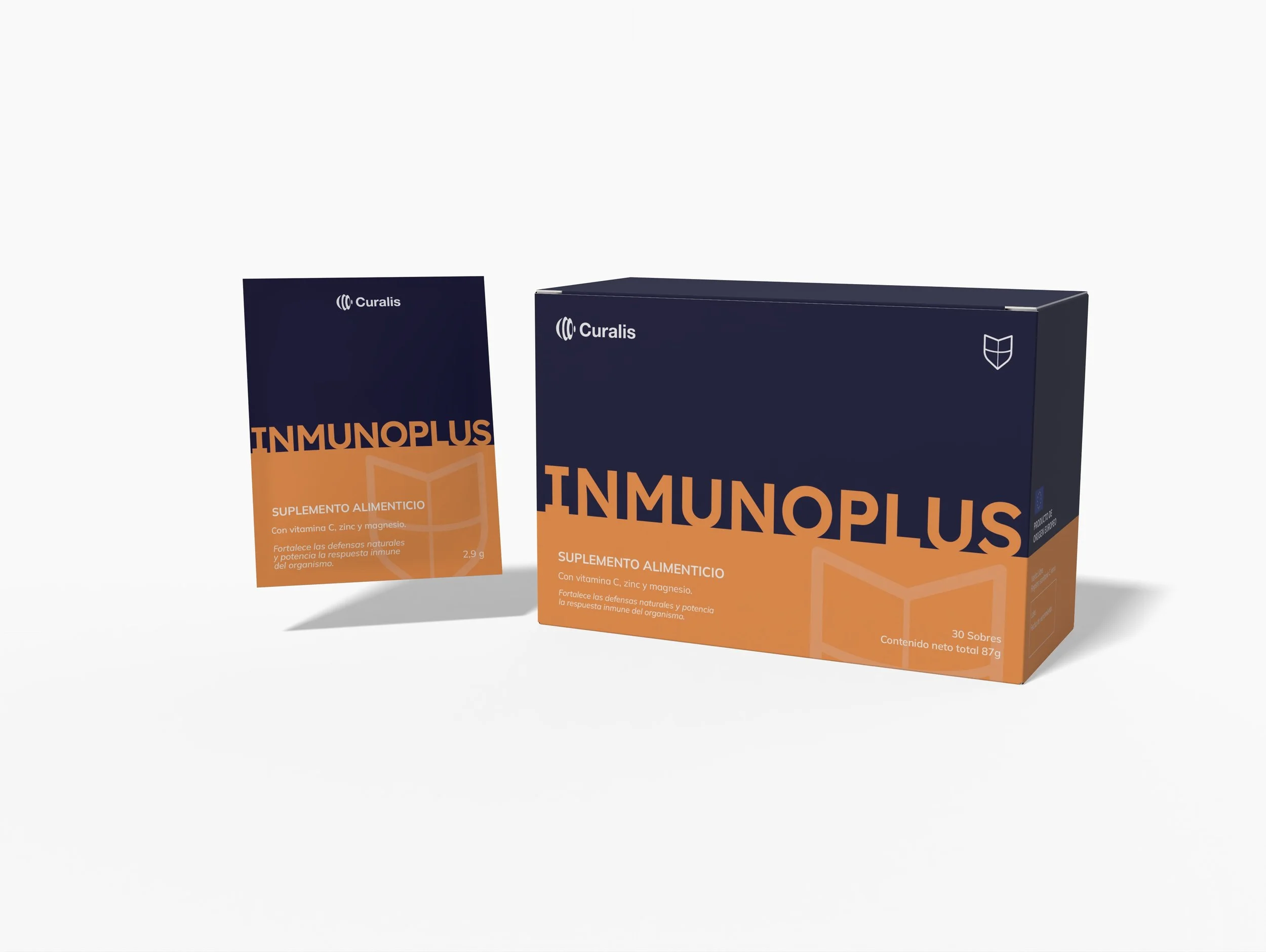
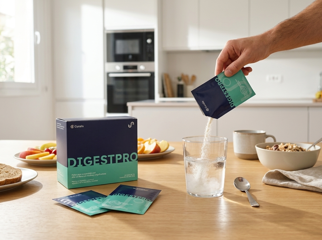
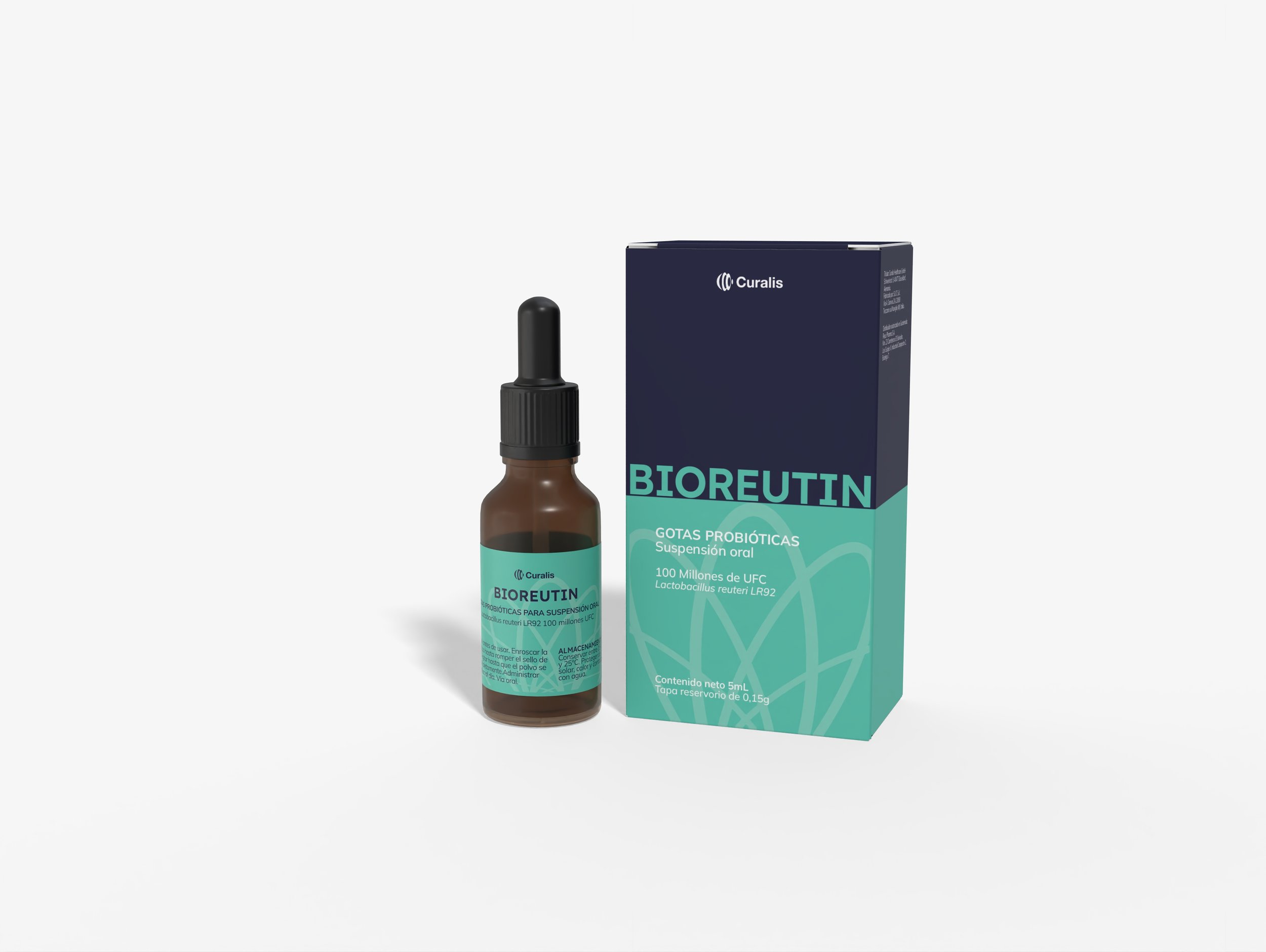
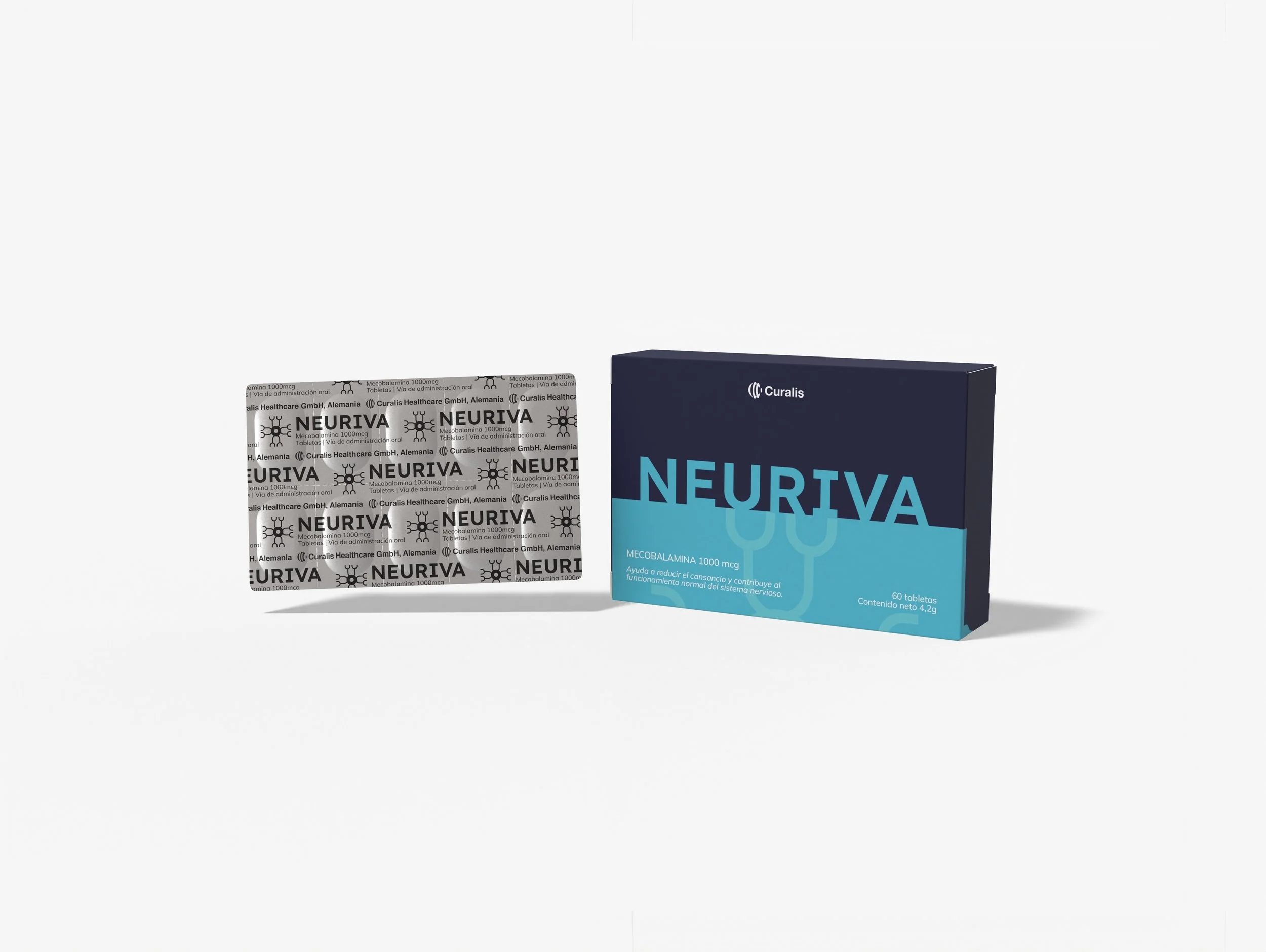
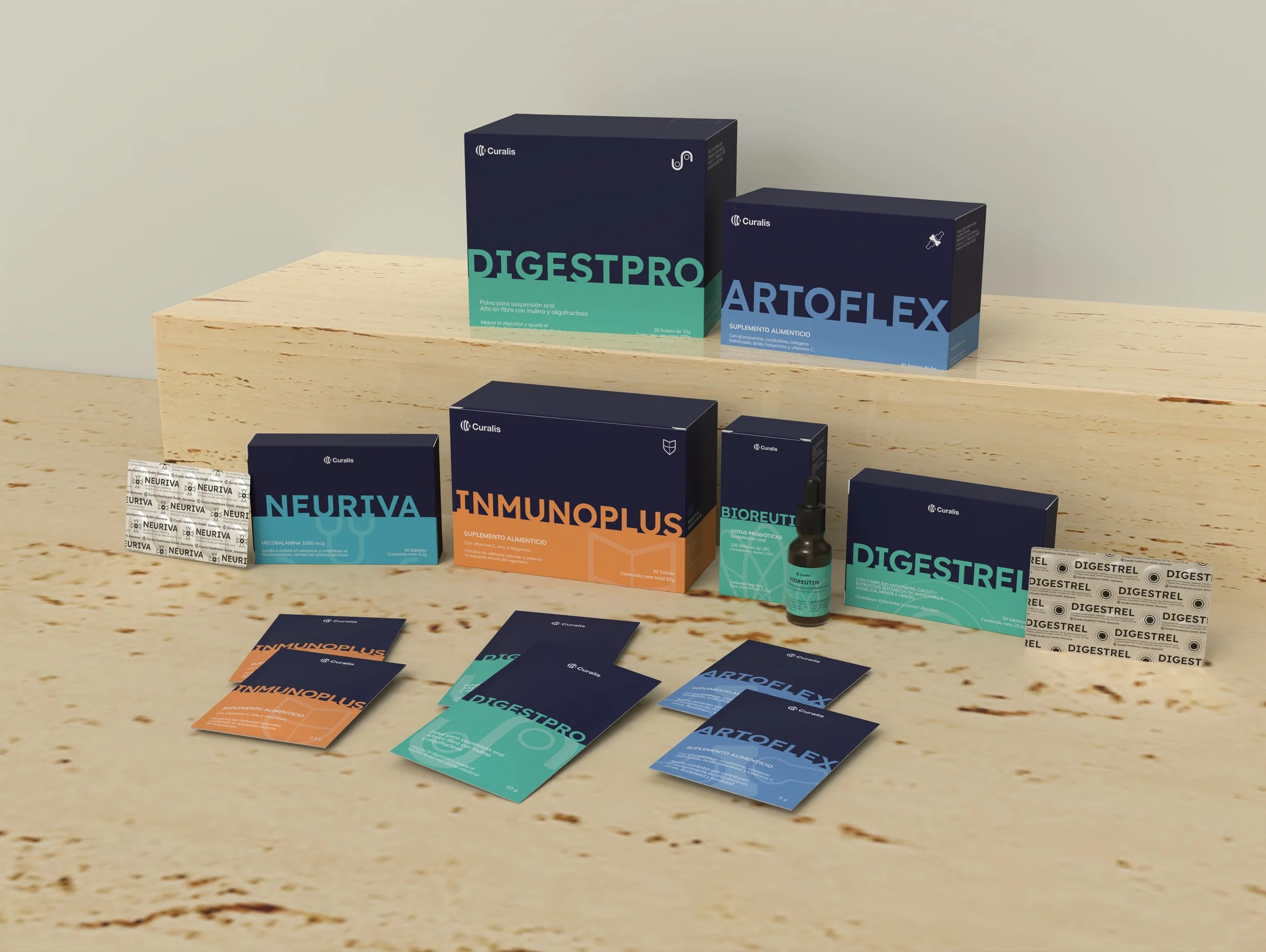
Rather than designing each product individually, we created a visual system that could bring consistency to the entire Curalis portfolio.
Each product family was assigned a specific color, creating an intuitive way to organize the range while making each category easily recognizable.
These colors were combined with Curalis’ signature navy blue, creating a stronger and more distinctive visual presence within a market often dominated by white and highly minimal pharmaceutical packaging.
A system built to grow.
Custom Iconography
A custom icon system was created to represent the different benefits and functions of each product.
Designed using the same visual language throughout the range, the icons help communicate information quickly while creating another recognizable element within the Curalis identity.
Together, color, typography and iconography create a system that can adapt as new products and categories are introduced.




More than an informational website, the landing page was created as an introduction to the brand — building trust, communicating its capabilities and inviting potential distributors, suppliers and partners to discover and work with Curalis.
Making information easy to understand and digest.